Tag: Credenza

  • Blaine desk & credenza

    Blaine desk & credenza

    blaine4

    [singlepic id=259 w= h= float=center]

    This client was re-doing his entire office and wanted something simple but nice for his office. We worked out a design for a matching set of furniture that was simple in form, but rich in details. 

    [singlepic id=264 w= h= float=center]

    There’s two parts to each of the designs. The first part is the outside dark layer. The dark layer is mahogany that has been stained to be a dark rich tone. The top flows down into the top, creating a continuous line. The legs end on the floor with a cap to create a visual punctuation mark.

    [singlepic id=265 w= h= float=center]

    The second part is the inner part and that is made from veneered panels of rippled sycamore. The photos don’t give this wood justice, but the wood grain shimmers as you walk around the piece as it catches different light source. To break up the spaces for the drawers, I inlayed a line of wenge. 

    [singlepic id=263 w= h= float=center]

    The hardware was picked out by my client and has a nice blend of traditional and modern element. It’s a nice visual stamp that breaks up the big vast white space and gives your eye something to follow.

    [singlepic id=261 w= h= float=center]

  • Bi-Fold Credenza

    Bi-Fold Credenza

    malinacred5

    This credenza came about from one of my past clients wanting a cabinet for storing and serving snacks when he has clients over. He wanted something simple that works with the rest of the furniture and decor in the room, but a design that can stand by itself also.

    [singlepic id=225 w= h= float=center]

    I wanted to focus on how the cabinet is used and engaged- first and foremost. I love an element of suprise when you open a door or drawer so I wanted a dark exterior and a light interior. The lightness also helps to show the contents of the cabinet in a better light. I started thinking about how the light interior is revealed to the user and wanted something theatrical. We went for a bi-fold door that reveals the contents a little at a time- like the curtains before a play is about to start. Each board of the walnut has a bevel on the edge so it creates a texture in regular intervals and makes the door read like many different boards rather than just two doors.

    [singlepic id=229 w= h= float=center]

    Most of the furniture in that room is walnut, so we chose solid walnut for the doors, but we didn’t want the walnut element to be too over powering so we decided on a painted exterior. We went for a forest green milk paint. we chose milk paint because it’s durable and wont chip off, but mostly because I’m interested in the idea of imperfections. It’s nearly impossible to get a perfectly consistent and flat paint job with milk paint as you get with spray paint or with using regular paint. But unlike regular paint where inconsistency is distracting, the slight difference in tones that milk paint brings enhances it and gives the piece a handcrafted element.

    [singlepic id=227 w= h= float=center]

    For the handles, I used a leather key chain made by an artist in London using nubuck leather and attached it to a brass tab that I custom made. The result is a soft tactile handle that is free moving so you can control the direction of the pull.

    [singlepic id=226 w= h= float=center]

  • Caswell Media Cabinet

    Caswell Media Cabinet

    caswell-media-1

    My clients approached me at a studio tour after seeing some of my works on display. They have been looking for a designer to come up with a solution to their music equipment storage needs. The husband is a music lover with music being a huge part of his life. His wife wanted something that covers up all of his equipment in an elegant and charming way. They came to me after being disappointed with other designers who couldn’t think outside the box- literally. One of the first things they told me was that it should have some curves and it should fit in with the rest of their house with all the art they have collected from years of going on trips.

    [singlepic id=171 w=320 h=240 float=center]

    The cabinet bows out in the middle creating a soft curve in the front. The solid wood doors follow that curve and have a slight concave surface. The concave curve is subtle enough that it’s not immediately obvious what’s going on. It’s only after you walk around and see the light wrapping and bouncing off the surface that you notice something is going on. Upon closer investigation, you notice the curves outlined on the bottom of the cabinet like gentle waves.

    [singlepic id=172 w=320 h=240 float=center]

    It’s a subtle thing, but the boards in the center are slightly narrower and the boards wider towards the outside so that as the curve stretches back, the boards look similar in scale to the others. To get a nice crisp line where the random sized boards meet, but keep the same depth of curve on the surface of the doors, I created a hand plane with a radius on the blade and sole so I can fine tune everything so it’s just right. The idea of doing things by hand appeals to me since people can subconsciously pick up on small irregularities that machines (robots) can’t reproduce- creating a warmer and friendlier piece.

    [singlepic id=173 w=320 h=240 float=center]

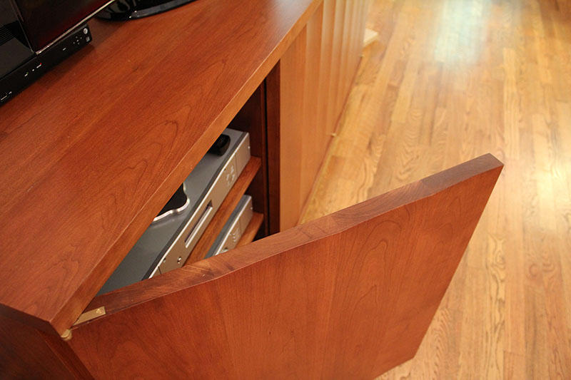
    The doors are hung using offset knife hinges. These discreet hinges don’t break up the clean lines but offer the ability to swing the to almost 180 degrees (or 270 degrees on the sides). Since any knobs or pulls would also break up the clean lines, we opted to go for the magnetic push latch handles. Just press on the door and pop, the door opens enough to get your hand behind the door.

    [singlepic id=170 w=320 h=240 float=center]

    The shelves are all adjustable and also follow the same convex curve as the cabinet front so everything is integral inside and out. The feet also has a gentle tapering curve to create unity but most importantly, the feet give the whole piece a human or animalistic feel. (not square and sharp like many modern furntiures out there).

    [singlepic id=169 w=320 h=240 float=center]

    I had my go-to finisher, Ken Boone, do some color matching to darken the cherry up a little bit, and then topped off with a lacquer finish. I delivered the media cabinet to a very happy client. – “Every time I walk in this room, I just take a long look at it and smile”

  • Tambour sideboard

    Tambour sideboard

    sideboard9

    I was approached to design a credenza/sideboard that matches a conference table I made in the past. A+L Conference Table. The main purpose for the sideboard was a storage unit that housed all their conferencing equipment when they weren’t using it as well as all the wires and misc things that should be hidden when it’s not used. The sideboard also makes a great platform to showcase all the awards they have won in the past.

    [singlepic id=124 w=320 h=240 float=center]

    Since there wasn’t a whole lot of space between the wall and the conference table chairs, I wanted to avoid having a door that swings out- especially if they needed the cabinet open for one reason or another. That left me with sliding doors or tambour doors as the options for the doors. Tambours are doors that slide in a track and roll so that it’s able to tuck into the sides and hide behind the back panel. You see this used on roll top desks.

    [singlepic id=127 w=320 h=240 float=center]

    After our design meeting, the client and I both agreed that tambours were the better choice for this situation. Not only does it look nicer, it’s a better solution functionally since you can reveal just the center shelf area, or open it all the way to showcase the whole interior of the cabinet. I also believe tambours have a certain nostalgic feeling that reminds us of beautiful furniture of the past.

    [singlepic id=130 w=320 h=240 float=center]

    The design inspiration came from mid-century modern furniture. I think the simplicity in form of the designers of this era got it just right. It’s hard to improve upon it, so I left the lines as clean as possible and tried to let all the details shine. Like many of SYD furniture, the eye is in the detail and the craftsmanship. Spend time on those elements and you don’t need fancy or unusual forms to stand out.

    [singlepic id=125 w=320 h=240 float=center]

    Most of the furniture in the room is made of pecan, so pecan was the natural choice of wood for this project. We didn’t want the room to look like a forest of pecan, so we decided to make the tambour doors out of a different, but complimentary wood. In this case, we decided on teak. The warm color of teak and the rich grain makes the door the focal point without taking all of the spotlight.

    [singlepic id=129 w=320 h=240 float=center]