Category: Bespoke

bespoke furniture

  • Welder Console

    Welder Console

    tvconsole1

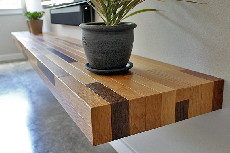
    My clients had been looking for years for a tv console to store all their media equipment in an elegant way. After countless frustrating hours and days of shopping online and going to other retail stores and not finding anything that would work for them, they were recommended to me by a mutual friend. Before they met me, they had no idea that people can get furniture made exactly the way they wanted to the dimensions that they needed it made to.

    [singlepic id=234 w= h= float=center]

    What they were looking for was fundamentally simple but the lack of customization that most retail furniture businesses offer made it difficult for them to find what they wanted. All they wanted was for their equipment to be hidden, have easy access to them when they need to switch out to new equipment as technology keeps changing , and for the speakers to be hidden. All of this while looking beautiful and built to last for generations.

    [singlepic id=235 w= h= float=center]

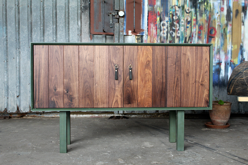
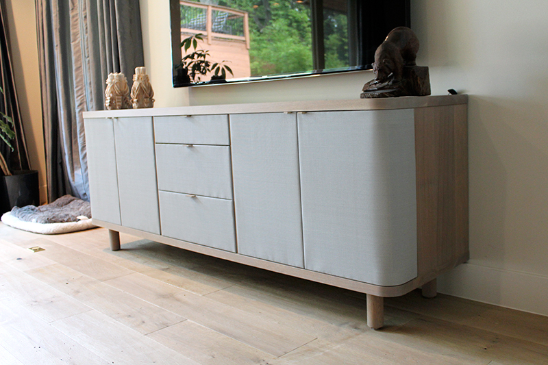
    After talking through them about the functional requirements for the piece, we started playing around with how it should look. They didn’t want anything that stands out too much and wanted it to blend in with the room. For the speakers to work inside the cabinet, we needed something that would let air flow through without disrupting sound. Also, since it’s a 4 speaker system, we needed to be able to space the speakers apart so the whole front side had to be wrapped in speaker cloth. The cloth also helped with ventilation problems that many media cabinets have. We decided on some nice speaker cloth made by accoustone and sold by accoustical solutions. They are professional grade speaker cloths with many different colors and textures to choose from. We took a functional requirement and turned it into a visual design feature.

    [singlepic id=238 w= h= float=center]

    The annoying part with any media cabinet is changing or wiring up new equipment. You have to reach in the back to a whole mess of cords and somehow finagle them through a small hole cut in the back of the cabinet. To make life easier, I made the back on this console removable in sections without any tools. Each section has a wide slot cut on the edge so no cords are ever trapped inside a hole. We left some gap between the wall and the back panel so that cords have some space to be wrapped up so it’s not just dangling down.

    [singlepic id=247 w= h= float=center]

    There are four doors on both ends- the furthest doors having a big radius on the corners. Bringing the speaker cloth around the corner like that lets the sounds escape in a much bigger area then if it was closed up the the sides. It also softens the credenza and keeps it from being too minimal and hard edged. The center bay has a drawer for remotes and other accessories at the top, a drawer that houses a center speaker, and the bottom part has a pull out tray that houses the receiver.

    [singlepic id=237 w= h= float=center]

    An unexpected feature that we didn’t think about with the speaker cloth is that when the lights are low, a diffused light from the receivers and equipment can be seen playing across the surface.

  • Antique Oak Shelf

    Antique Oak Shelf

    reclaimed-shelf3

    At the same house that we recovered the old growth pine from (read the last post here), there were also nice solid white oak flooring. Flooring has been reused as furniture in many different ways (mostly country style hutches or country style tables) but I wanted to use the flooring in a modern way. My client wanted to use the reclaimed lumber as a Tv stand so I took that idea and went for a long sleek floating shelf that sits under the television.

    [singlepic id=246 w= h= float=center]

    I saw that the story behind the lumber was the highlight of this design so I didn’t want that aspect to get lost. The flooring was put down sometime in the 30’s and the tree that produced those flooring had several decades of life before it was even cut down- so these oak boards have a rich history. To bring the idea that these boards were used as flooring in it’s past life, I laid the boards out like regular flooring- with boards butting into the next board at irregular intervals. The actual recovered flooring was too wide to create a harmonious layout, so I cut down all the boards down to create better proportions. To further highlight the flooring, I put a slight bevel around each boards.

    [singlepic id=223 w= h= float=center]

    The story is the most important part, so I wanted the design to promote guests to ask about it and have conversations about it. I went with three different tones for the flooring. This further makes the flooring concept more concrete and creates an eye-catching detail. I thought that if I left the shelf as a monotone oak shelf, then guests would just think to themselves “oh that’s cool, they used flooring to make a shelf”- not pursuing the thought any further. Instead, I wanted the reaction to be more like “whoa, what’s going on there?”- and then hopefully that would invite the guests to inquire more about it.

    [singlepic id=222 w= h= float=center]

    The shelf looks simple to make, but there’s some technical elements that needed to be thought out before hand. First, we didn’t want any exposed hardware, so everything had to be hidden. Second, the shelf ends up around seat height and anything placed at seat height invites people to take a seat whether you want them to or not. Also, with three kids running around, I needed something strong enough to withstand them jumping and hanging from them. The shelf support bracket that I installed came from A&M hardware and it’s designed to hold a tremendous amount of weight but also remain hidden. The only catch is that they have to be installed before the drywall goes on- which wasn’t a problem for us because I was called in before the new house construction was too far along. The final installation has a 1/4″ oak plywood on the bottom to hide the hardware and construction when someone looks underneath the shelf.

    [singlepic id=224 w= h= float=center]

  • Ship Lap Island

    Ship Lap Island

    reclaimed-island5

    A real estate developer approached me with a challenge. He had an old 1930’s dilapidated home that was scheduled for demolishing, but he knew there was some nice old lumber used in the house so asked me to come up with some modern designs using the wood from this home. My first thought was “this is going to be a lot of work”, but when I saw the wood and started toying around with the idea, I couldn’t get it out of my head.

    [singlepic id=218 w= h= float=center]

    I knew many houses built back then used just nailed pine boards on the house framing as the wall and then plastered over it. As soon as I got permission, I started tearing the plaster off and what I found were beautiful, wide, ship lap pine with very little defects. I took off as much as I could grab in a day, and took it back to the shop to start pulling all the nails out.

    [singlepic id=219 w= h= float=center]
    We decided to use the recovered pine as the kitchen island. Using the pine for the kitchen island is a great use for it since the old growth pine would withstand all the beating of every day living over the years- especially with three kids running around. Usually, reclaimed pine is left with the patina and grime to keep that ‘reclaimed’ look, but I wanted something cleaner. The pine itself is old-growth pine so the tone is beautiful even when new wood is exposed. Rather than making the boards sit tight against each other like it was originally, we went for a little bit of a gap in between so we could accentuate the ship lap aspect part of the original wall and tie the history of the boards into the design. The difference in each board is a big part of the beauty of these boards, so we laid the boards out in a random pattern to bring out the individuality in each boards.

    [singlepic id=217 w= h= float=center]

    The kitchen island wraps from the back all the way to the side and then back around to the front. In the front, the pine wraps into the kitchen cabinets, tieing the whole kitchen together. In a modern room, this little island adds character, history, and warmth to this family in this new home.

    [singlepic id=220 w= h= float=center]

  • Bi-Fold Credenza

    Bi-Fold Credenza

    malinacred5

    This credenza came about from one of my past clients wanting a cabinet for storing and serving snacks when he has clients over. He wanted something simple that works with the rest of the furniture and decor in the room, but a design that can stand by itself also.

    [singlepic id=225 w= h= float=center]

    I wanted to focus on how the cabinet is used and engaged- first and foremost. I love an element of suprise when you open a door or drawer so I wanted a dark exterior and a light interior. The lightness also helps to show the contents of the cabinet in a better light. I started thinking about how the light interior is revealed to the user and wanted something theatrical. We went for a bi-fold door that reveals the contents a little at a time- like the curtains before a play is about to start. Each board of the walnut has a bevel on the edge so it creates a texture in regular intervals and makes the door read like many different boards rather than just two doors.

    [singlepic id=229 w= h= float=center]

    Most of the furniture in that room is walnut, so we chose solid walnut for the doors, but we didn’t want the walnut element to be too over powering so we decided on a painted exterior. We went for a forest green milk paint. we chose milk paint because it’s durable and wont chip off, but mostly because I’m interested in the idea of imperfections. It’s nearly impossible to get a perfectly consistent and flat paint job with milk paint as you get with spray paint or with using regular paint. But unlike regular paint where inconsistency is distracting, the slight difference in tones that milk paint brings enhances it and gives the piece a handcrafted element.

    [singlepic id=227 w= h= float=center]

    For the handles, I used a leather key chain made by an artist in London using nubuck leather and attached it to a brass tab that I custom made. The result is a soft tactile handle that is free moving so you can control the direction of the pull.

    [singlepic id=226 w= h= float=center]

  • Logan Desk

    Logan Desk

    andrewdesk

    My client came to me to create a new desk for his home office. He is a producer at a video production company so he’s constantly on the move and having to work in different locations. He wanted something clutter free at his home office but easy for him to hook up his laptop and keep all the cables and plugs hidden. We went for a stripped down look, focusing on letting the functionality express the form.

    [singlepic id=242 w= h= float=center]
    The first question was what to do with the power cord and all the other cables. Instead of reaching down under the desk to find an outlet every time, we brought the electrical power source up to the desk so it’s always in easy access. The electrical plugin needs to be hidden but also easy to access- so the flip top cubby holes towards the back of the desk made the most sense. There is a notch that acts as a handle as well as a place for the cord to come out.

    [singlepic id=245 w= h= float=center]

    There’s also three drawers that slide out in the front for all the paperwork and sized so that a laptop could be stored inside. The middle drawer has a pencil tray for quick access to jot down notes. As for the rest of the form, we wanted the cubby holes to be deep enough to store all sorts of things so we made the back section deep. The drawers in the front couldn’t hang too low to allow enough space for the legs, so we tapered the side from deep cubby up to narrow drawers. For the legs, we opted for the most stripped down form we could do use without compromising strength. The legs are steel rectangles bolt on from the inside of the desk.

    [singlepic id=243 w= h= float=center]

    The desk is finished with hand rubbed oil so it ages nicely and any scuffs or dings will only give it more character instead of calling attention to itself. The steel legs are left raw and waxed to keep that beautiful raw steel look.

    [singlepic id=241 w= h= float=center]

  • Lounge Chairs

    Lounge Chairs

    lounge2

    I’ve always wanted to design and make my own chairs, but have never had the opportunity to do so, so I used the East Austin Studio Tour as a reason to design and make my first chair. Chairs are furniture that is the demands the most from craftsmen. First, it has to be strong enough to withstand all the weight and wracking force of the sitter. Then, it has to comfortable enough for the sitter to sit in for a long time. Then, it has to serve the function of that specific chair. A dining chair should be light and upright so it’s easy to move around and eat from. A lounge chair should be a little lower with more angle so it invites relaxation, but it shouldn’t be hard to get out of. And then finally, it has to look great. Not just from the front and sides, but from all angles.

    [singlepic id=189 w= h= float=center]

    For this chair, I went for unorthodox or different joinery methods so I can experiment and play around. Why make anything speculatively if you don’t push the limits, right? My design focus was for the seat and back to be one unit, and that these curved boomerang shapes will be the focus of the form. I brought the front legs from the sides and attaches to the side with an angled half lap joint with pegs to make it extra sturdy. I also brought the back legs in from the side and created the joinery so that the back legs are visually and physically holding the seat up. The angle of the legs makes the chair joint harder to break but it also keeps the sitter from being able to tilt the whole chair back on just the back legs. The back legs are mortise and tenoned in to the seat with dowels for extra grabbing power.

    [singlepic id=186 w= h= float=center]

    For the seat and back rest supports, I decided to laminate oak into curved slats that mimic the chair sides. The lamination makes it so I can get away with thinner material and makes the chair look nice with or without the upholstery. But just in case one of them does fail, I installed the slats using a dowel that has been hammered to create a mushroom like metal rivets. The wood rivets makes for a nice visual as well as tactile experience. I think the slats also make the piece look Nakashima-esque, but I may just be flattering myself.

    [singlepic id=185 w= h= float=center]

    You can’t have a lounge chair without cushions, so I commissioned my quilting and sewing friend Shannon Harris, to design and create the cushions to that would go well with the chairs. She came up with a simple and modern upholstery design using hexagons that compliments the lounge chairs well. I think the unique design fits in with the unique design of the chair perfectly. There is also a feeling of masculine and feminine to the chairs and upholstery by the wood and colors chosen. Also, for the show I asked Shannon to design a quilt that we could drape over the back of the chairs to create another layer. I also think it brings a feeling of warmth and that the furniture is ‘lived in’. The quilt is beautiful! the hexagon pattern flows from one corner to the other with changing tones. It speaks to the modern aesthetic while bringing warmth- which a lot of modern designs are lacking in.

    [singlepic id=215 w= h= float=center]