Category: Bespoke

bespoke furniture

  • Harmonson Credenza

    Harmonson Credenza

    harmonsoncredenza6

    [singlepic id=105 w=320 h=240 float=center]

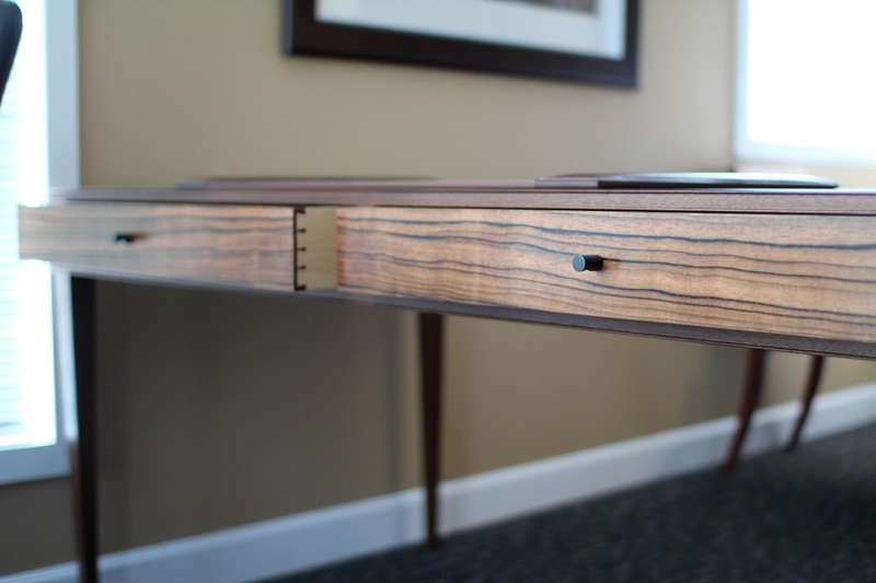
    This is the follow up project to the Harmonson Desk. Like I mentioned in the desk post, this client likes to keep his room uncluttered. So for the credenza, he asked me to create a design where everything can be hidden except for a phone which will sit on top of it. All of the office equipment and accessories would need to be stored in there and be able to plug in. He also needed access to a hanging file cabinet, so we incorporated a hanging file drawer into the design.

    [singlepic id=108 w=320 h=240 float=center]

    The credenza is on the bigger side- measuring 8′ long, 16″ deep and 30″ high. Most of the design elements are stripped down to emphasize the Macassar ebony- the star of the show. I focused on subtlety and added small bevels where the ‘feet’ and ‘head’ meet the body. The credenza is divided into five sections, each with a door in front of it. The very left section housed 4 drawers with one of them being a hanging file cabinet drawer. The 2nd to the left and the middle section is one long section with adjustable shelves. The 2nd from the right has small adjustable shelves, and the far right has 3 pull out trays.

    [singlepic id=109 w=320 h=240 float=center]

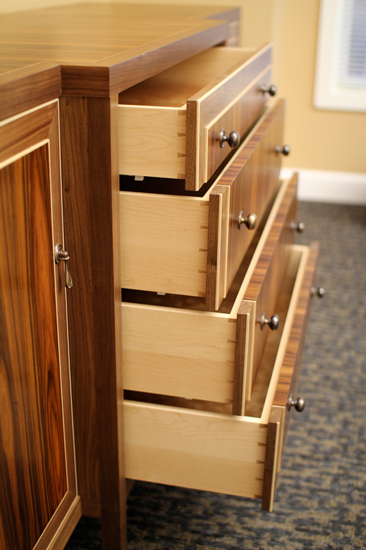
    To match the desk, we chose mahogany and Macassar ebony. Most of the credenza is made from solid mahogany and the doors are made from Macassar ebony veneered panels. Most commercial plywood has a bookmatch sequence which means they take the veneer slices in the order it was cut and the flip it so it creates a mirror image of the figure. This creates an interesting look, but I find that the repetition becomes all too evident when people use commercial plywood- especially when the veneer slices are narrow in width. The reason solid wood construction is so pleasing to look at is because no two boards are alike. It’s complete randomness- although the boards should be similar in figure and color. To achieve that random look, I ordered Macassar ebony veneer all from different flitches (trees). That way, there’s no chance I will get repetition of any one grain pattern.

    [singlepic id=111 w=320 h=240 float=center]

    The drawers are made with hand cut dovetails and I used side mount drawer guides. The reason for that is in order to maximize the available space for the hanging files, I oriented the drawer to make it into a lateral file system (which means that the hanging files slide side-to-side instead of front-to-back). This orientation meant that the back of the drawer had to be able to pull out past the front of the drawers above it. This called for special guides called overextension guides and they’re only available as side mount drawers. It’s a shame to have to cover up some of the hand cut dovetails with these metal guides, but functionality trumps aesthetics. The drawer fronts have a recessed cut-out for the drawer handles due to the fact that the door needs to be able to close.

    [singlepic id=107 w=320 h=240 float=center]

    [singlepic id=114 w=320 h=240 float=center]

    For the hinges, I used Brusso offset knife hinges because I wanted the doors to be able to swing 270 deg. for the outside doors (which means it can fold back around the cabinet sides) and 180 deg. for the internal doors (which means that the doors can completely overlap the doors that are next to it.) You don’t see these hinges very often and they are reserved for fine furniture because it’s difficult to install them. First, they have to be morticed into the cabinet and doors, but also there is no adjustability once it’s in, so everything has to be made perfect. Since I wanted the doors to be able to overlap the next door over, it meant that I couldn’t have any handles projecting from the doors. I also didn’t want anything recessed into the doors since that will disrupt the flow of the Macassar ebony, so I ended up using magnetic push latches made from Blum.

    [singlepic id=106 w=320 h=240 float=center]

    I also created a small shelf for him so he can display his photos or some books. It repeats the angle taken from the top of the credenza and has a black steel backsplash detail to anchor the shelf to the wall.

    [singlepic id=112 w=320 h=240 float=center]

  • Harmonson Desk

    Harmonson Desk

    harmonsondesk2

    This client likes to keep his office clean and uncluttered so when he asked me to create a new desk for him, I suggested we create a desk where it has the appearance of being light and airy. Most executive desks have a heavy look that makes the occupant look intimidating. How can you do business with someone that’s intimidating? The best thing a person can do is to achieve rapport.

    [singlepic id=101 w=320 h=240 float=center]

    What storage we lose from taking out the cabinets for drawers or doors that many desks have is to create drawer spaces in the space where the apron is- and also building a credenza to match the desk for many of the storage and office equipments.

    [singlepic id=97 w=320 h=240 float=center]

    At 60″ long and 32″ wide, the desk is on the bigger side. The desk is wide enough for two people to sit across from each other and have enough space to have conversations or to exchange in business negotiations. The extra size also allows for ample space to layout paperwork and it gives the ability to easily be organized. (The desk pad is on the bigger side, so in the photo, the desk may look smaller than it actually is.)

    [singlepic id=99 w=320 h=240 float=center]

    The wood chosen for this project is Mahogany for the frame work and Macassar ebony for the panels. I took design elements from traditional furniture designs and stripped it down to the essentials. The two wide drawers are hand dovetailed drawers that slide in wooden guide rails. There’s something soothing and pleasant about the feel of wooden guide rails. With this design, the charm of the whole desk would have been lost with manufactured drawer guides.

    [singlepic id=104 w=320 h=240 float=center]

    [singlepic id=102 w=320 h=240 float=center]

  • Outdoor Bench with Sliding Table

    Outdoor Bench with Sliding Table

    berbench2

    This outdoor bench was made to fit against a stone wall at my client’s backyard garden. We wanted to highlight the stone wall since it was one of the key features that tied the whole backyard together. We decided to use clean, simple, lines to design the bench. The bench uses 2 1/2″ thick boards of mahogany since it needs to span 8 feet, but it also gives the bench a visual weight that helps to make the simple lines bold. The stone wall can be used as a back rest. The use of natural materials used in this raw way is appealing to me. There’s little frou frou and the heaviness of each of the materials fits with the concept of the outdoor space.

    [singlepic id=91 w=320 h=240 float=center]

    [singlepic id=92 w=320 h=240 float=center]

    The garden backyard was designed not only as a garden, but also as a social place where guests can enjoy each other’s company outdoors as many people here in Austin love to do. With that in mind, we designed the bench with a table that slide along the length of the bench. This sliding table serves not only to hold guest’s drinks or plates, but it also gives more flexibility to different kinds of guests. If there’s a couple that want to sit next to each other, then move the table over. If you just want to sit with a friend for a chat, then you can also share the table by sliding it in between. Maybe someone is telling a story and everyone wants to sit on the bench, then you can roll the table off to squeeze another person in.

    [singlepic id=93 w=320 h=240 float=center]

    [singlepic id=90 w=320 h=240 float=center]

    The bench is finished using Sikkens Cetol 1+23 system.

    [singlepic id=94 w=320 h=240 float=center]

  • The Johansen Table

    The Johansen Table

    img_4008

    This client wanted a dining table that would fit into their tight dining area.They love to entertain, so the dining table had to be able to expand to seat more people.The circular dining table is constructed in two halves with sliding aprons that hold two extra leaves. My clients love the danish modern look of sleek and clean but also keeping the depth and character of the wood alive. What we came up with is a design that takes inspiration from Harry Ostergaard. The Johansen table is constructed with stack lamination for the apron with a tapered leg attached by a dovetail joinery.

    [singlepic id=85 w=320 h=240 float=center]

    Traditionally, when building a circular table, craftsmen would stack laminate their aprons out of inferior woods like poplar and then veneer the face of it with beautiful wood like mahogany or rosewood. To me, the different layers and the changing grains of the stack lamination is beautiful in itself, so I decided not to cover it up, but turn it into a design element. We ended up with the dovetail joinery for the legs because it was the most honest connection. Anyone looking at it can visually see that the legs aren’t coming apart.

    [singlepic id=87 w=320 h=240 float=center]

    The table is all constructed out of American Black Walnut except for the Maple sliding rails for the extra leaves. It is finished with a hand rubbed oil finished off with a layer of wax.
    [singlepic id=86 w=320 h=240 float=center]

  • FWC Credenza

    FWC Credenza

    fwccredenza1

    My client, Far West Capital, came to me asking me to build a credenza to match a conference table I had made for them earlier this year out of Rosewood and Walnut. My first thought was that the form should be simple and understated so it doesn’t take away from the conference table. Rosewood is a dominant wood that overpowers almost everything so it’s best to let the wood speak out and keep everything else simple. I also loved the way the white inlays helped outline and accent the dark timbers so I made that my sole design focus. What I ended up with is a design that’s very refined and exquisite not because of the forms or shapes but because of the details and the natural beauty of the wood.

    [singlepic id=83 w=320 h=240 float=center]

    The doors, drawers, and side panels are ‘raised’ panels with the rosewood panel sticking proud of the walnut frame. The raised panel is used often in traditional furniture and a solid piece of wood, beveled to fit inside a frame. With this piece, I raised the panel but kept the edges square and crisp. This creates a three dimensionality to the panels while keeping the the square and rectangular feel of the credenza. And with the use of a thin inlay, the final effect is more modern than traditional.

    [singlepic id=81 w=320 h=240 float=center]

    The interiors are made of Cherry. I chose a contrasting wood because I find it pleasant to see a light interior whenever a person opens up a dark cabinet. Traditionally, this was done because most houses had poor lighting. When the interior is lighter, it makes it easier for people to find what they’re looking for. I’ve kept the inlays going even on the inside panels of the cabinet even though it’s not visible unless you open the doors. I believe every area needs just as much attention as the rest of the piece.

    [singlepic id=84 w=320 h=240 float=center]

    The drawers are made of hard maple and they are joined with hand cut dovetails. Hand cut dovetails are becoming a rarity. It takes time to cut dovetails by hand, all your tools need to be super sharp and well tuned up, and it takes a lot of practice to get the skill. Machine cut dovetails are great for mass production since they’re faster to cut and takes less skill, but I’m a firm believer that hand cut dovetails are far superior and worth the extra effort and time. When you cut dovetails by hand, you can make the pins as small as the thickness of your saw blade on your handsaw. The smallest pins you can have on machine cut dovetails is limited to how small the router bit is (1/4″). Also, there’s much more freedom in the layout of the dovetails when you cut them by hand. You’re not limited to what the router jig is capable of, and the setup time for getting the dovetails exactly the way you want on the jig offsets the extra time it takes to hand cut dovetails. So at the end of the day, machine cut dovetails look too uniform and if I’m being perfectly honest, just plain boring. Even dovetails deserve the attention of proportions- not just whatever’s easiest.

    [singlepic id=82 w=320 h=240 float=center]

  • Far West Capital Conference Table

    Far West Capital Conference Table

    FWC Conference Table
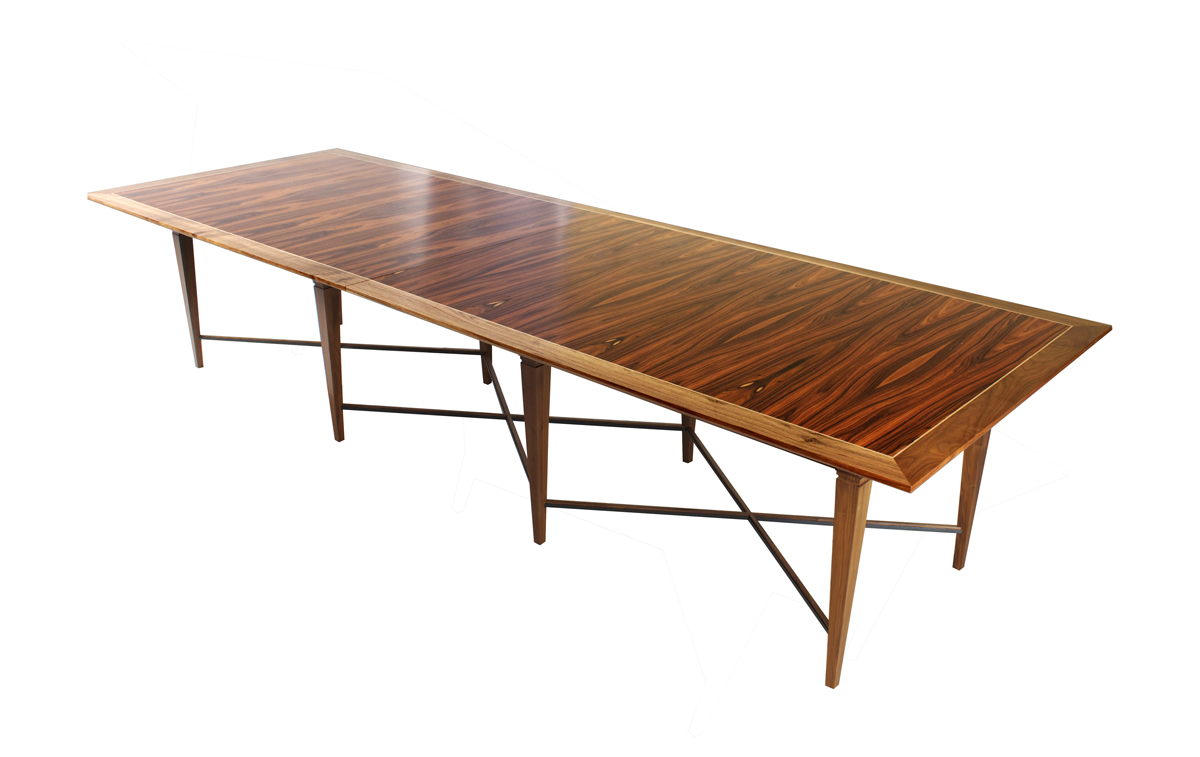
After seeing the conference table I had built for Arts + Labor, my client wanted a table with the same level of impressiveness. He told me that upon walking into the Arts + Labor conference room, he was immediately struck by the conference table. He couldn’t pin point what had made it special, just that it left him wanting one like it. “I want a table that stands out.”

    [singlepic id=55 w=320 h=240 mode=watermark float=center]

    Now, Far West Capital is a rapidly growing financial company that specializes in giving loans to small businesses. More on what they do at http://www.farwestcap.com/. To me, the most important traits any business that is in the business of loans need to convey is trust and stability. People need to know that they can trust these people and that they will be around for a long time. I started thinking about timeless designs and wanted to root this design on traditional design. Look at any cathedral or old houses and there are certain aspects that still remain relevant to us today. I wanted this table to be something that people generations from now will still nod their head in approval.

    [singlepic id=52 w=320 h=240 mode=watermark float=center]

    Traditional or period furniture is nice and can convey timelessness, but our tastes have changed since then and will continue changing. Contemporary design strips detail and decoration down to clean and simple lines, so I looked for the designs that best matched those principles. I found them in Regency and Federal furniture- they are simple forms with just enough detail to add character.

    [singlepic id=53 w=320 h=240 mode=watermark float=center]

    The table is made entirely of American Walnut except for the table top, which is Pau Ferro, aka Santos Rosewood or Bolivian Rosewood. For this design, most of the focus is centered to the top, so Wow factor needs to be there. I chose Pau Ferro because the color matches the walnut and the grain is just gorgeous. With the finish on there, the table just pops out at you. One principal I live by is “If you have beautiful looking wood, don’t do anything to it. Just let it do it’s thing.”

    [singlepic id=51 w=320 h=240 mode=watermark float=center]

    One other key design element is the cross rails towards the bottom of the legs. Without those, the element of repetition is lost (8 legs). I felt the legs needed to be tied in together somehow visually, but not necessarily structurally. Hence, the thin cross rails. To prevent people from kicking it and snapping the delicate rails off, I reinforced it with steel, which doubles to highlight the X shape.

    [singlepic id=54 w=320 h=240 mode=watermark float=center]